Build Your Author Website Like a Pro Without the Tech Headaches, High Costs, or Design Nightmares
Everything you need to create a professional author website that attracts readers—platform comparisons, design templates, and step-by-step guides from successful authors.
- Used by Published Authors
- 100% Free resources
- No Tech Skills Required
Your author website is your home base on the internet.
The one place you own and control, unlike social media platforms that can change or disappear overnight. But most authors either skip building a website entirely or create something that looks amateur and doesn’t serve their goals.
Below you’ll find everything you need to build an author website the right way: the complete roadmap from domain name to launch, honest comparisons of website platforms to find your best fit, guidance on essential pages every author needs, design tips from successful authors, how to choose between WordPress, Squarespace, Wix and others, and the critical mistakes that make websites ineffective.
Whether you’re building your first site or redesigning an existing one, start with the area where you need help most.
Build Author Website Topics
Click below below to jump straight to the topic.

Your Complete Website Roadmap: From Domain Name to Launch Day

For many authors, the thought of building a website is more intimidating than writing a 100,000-word novel. It feels technical, expensive, and overwhelming. But it doesn’t have to be. Your author website is the most critical piece of your marketing platform—it’s the one piece of the internet you truly own and control.
It’s your digital home base, your 24/7 salesperson, and the central hub of your author business. In 2025, not having a professional author website is no longer an option; it’s a necessity.
This roadmap will demystify the entire process of building an author website, breaking it down into simple, manageable steps. We’ll guide you through Choosing Your Domain Name, understanding the difference between Website Hosting options, and planning your Website Structure for a seamless user experience.
We’ll cover the fundamentals of Designing for Your Readers and the crucial, often-overlooked tasks of Website Maintenance and Updates. Whether you’re a complete technophobe or just looking to improve your existing site, this roadmap will take you from a blank page to a professional, effective author website without the tech headaches or budget nightmares.
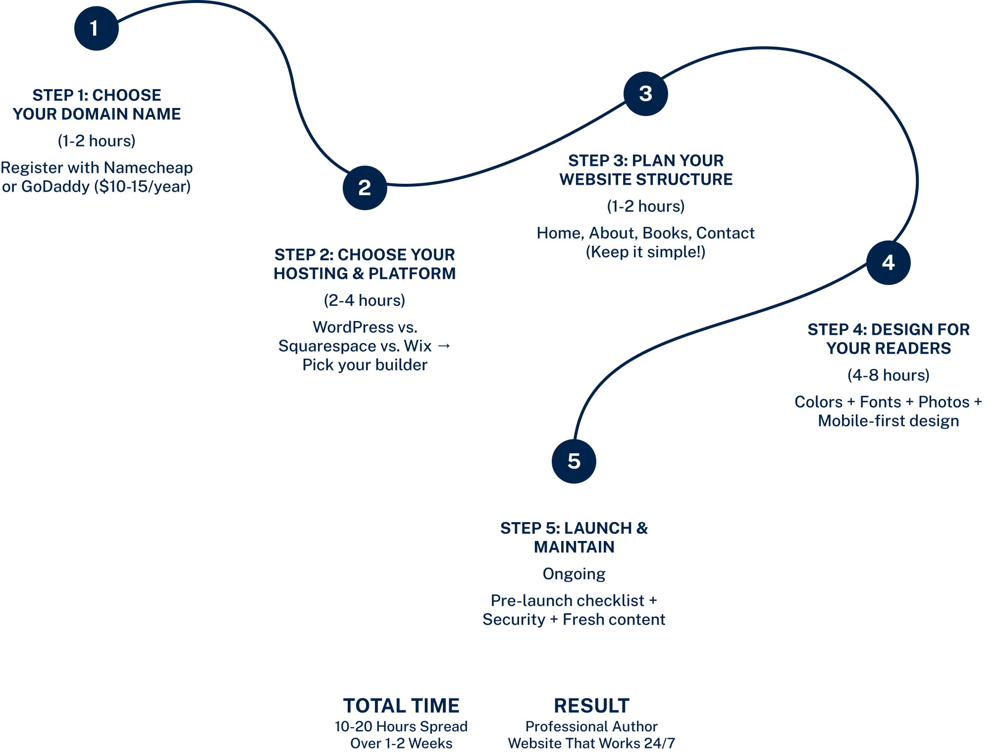
You Website Roadmap: 5 Steps To Launch
Step 1
Choose Your Domain Name
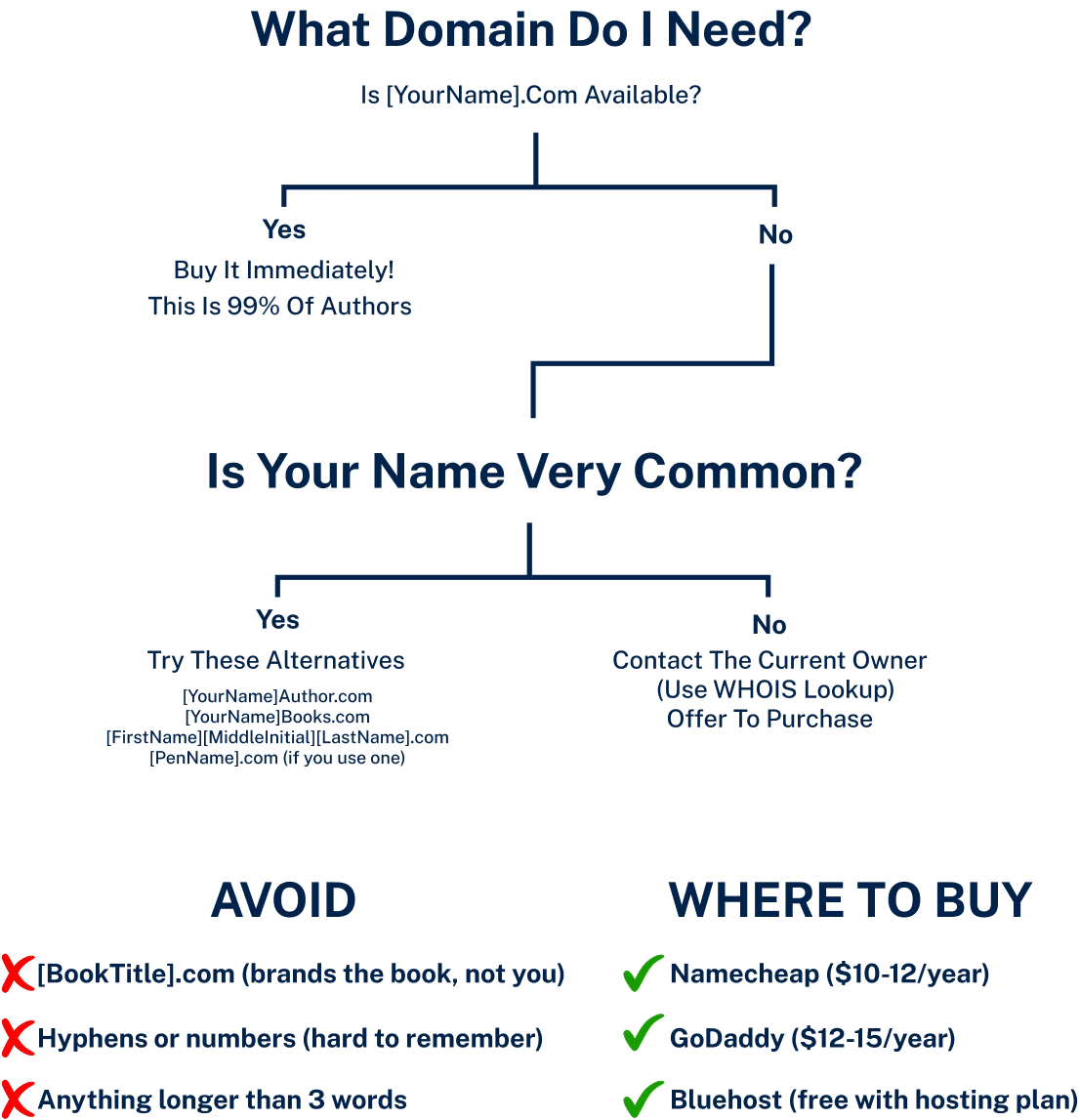
Your domain name is your address on the internet. It should be simple, memorable, and professional. You have two primary options:
- Your Name: [YourAuthorName].com. This is the best and most future-proof option. It brands you, the author, not a specific book or series. This is the recommended choice for 99% of authors.
- A Creative Alternative: If your name is very common or already taken, you can get creative (e.g., [YourAuthorName]Books.com or [MainCharacterName].com). However, always aim for your own name first.
You can purchase your domain name from a registrar like Namecheap or GoDaddy for about $10-$15 per year. Many hosting providers, like Bluehost, will also give you a free domain name for your first year when you sign up for a hosting plan.
Choosing your domain: decision tree
Pro tip:
Don't overthink your domain name. Your author name is almost always the right choice. If [YourName].com is taken, don't spend weeks agonizing over alternatives—just add "Author" or "Books" to the end. Readers care about your books, not your domain name. The biggest mistake is delaying your website launch because you're stuck on finding the "perfect" domain. Buy a good-enough domain today and move forward. You can always buy a better one later and redirect it.
Step 2
Choose Your Hosting and Platform
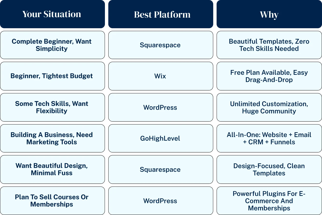
This is the most important technical decision you will make. Your platform is the software you use to build and manage your site, and your hosting is the service that keeps your site online.
- All-in-One Website Builders: Platforms like Squarespace and Wix bundle the builder and hosting together. They are known for being extremely user-friendly, with drag-and-drop interfaces and beautiful templates. They are a great option for beginners who want a simple, beautiful site without much fuss.
- Self-Hosted WordPress: This is the most powerful and flexible option, powering over 40% of the internet. You choose a hosting provider (like Bluehost or SiteGround) and then install the free WordPress software. It has a steeper learning curve but offers unlimited customization and control. Our guide “WordPress.org vs. Squarespace vs. Wix” provides a detailed comparison.
- The All-in-One Business Platform: For authors who want to go beyond a simple website and build a true online business, a platform like GoHighLevel combines a website and funnel builder with email marketing, course hosting, and a full CRM. It’s the ultimate power tool for author-entrepreneurs.
Which Platform is right for you
Pro tip:
If you're torn between platforms, start with Squarespace for 30 days (free trial). Build your site, test the interface, and see if it meets your needs. If you outgrow it or want more control, you can always migrate to WordPress later. Most authors never need to migrate—Squarespace is powerful enough for 80% of author websites. The key is to launch something instead of endlessly researching. A live, imperfect website beats a perfect website that never launches.
Step 3
Plan Your Website Structure
Before you start designing, you need a blueprint. A good author website is simple and easy to navigate. Don’t overcomplicate it. You only need a few key pages.
- The Essential Pages: We cover these in detail in Section 4, but at a minimum, you need a Home page, an About page, a Books page, and a Contact page.
- Site Map: Sketch out how your pages will link together. The goal is to make it as easy as possible for a visitor to find what they’re looking for, whether it’s your latest book or your email sign-up form. Our guide “Site Map for Author Websites: Navigation That Makes Sense” provides templates.

Which Website Platform Is Right for You? WordPress vs. Squarespace vs. Wix

Choosing your website platform is the single most important decision you’ll make when building your author website. It determines how your site will look, how it will function, how much it will cost, and how much control you’ll have over its future. The market is dominated by three major players—WordPress, Squarespace, and Wix—each with passionate fans and vocal critics.
On top of that, design-focused platforms like Showit and all-in-one business systems like GoHighLevel present compelling alternatives. There is no single “best” choice for every author; the right platform for you depends entirely on your technical comfort, your design goals, your budget, and your long-term business ambitions.
This section provides an honest, head-to-head comparison of the top website platforms for authors. We’ll break down the fundamental differences between them, explore the pros and cons of each, and help you choose the platform that actually fits your needs instead of fighting against one that doesn’t.
We’ll explain why WordPress.org offers unparalleled freedom and power, why Squarespace is the king of beautiful, minimalist design, and when Wix makes the most sense. This is your guide to making a confident, informed decision that will serve you for years to come.
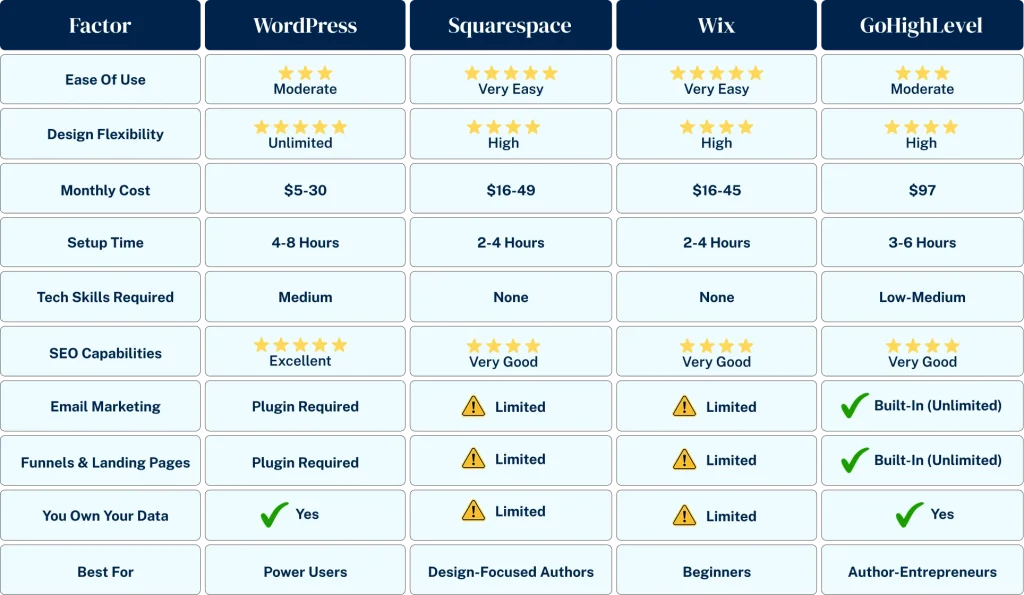
WordPress vs. Squarespace vs. WIX vs. Gohighlevel
Five Year Cost Comparison
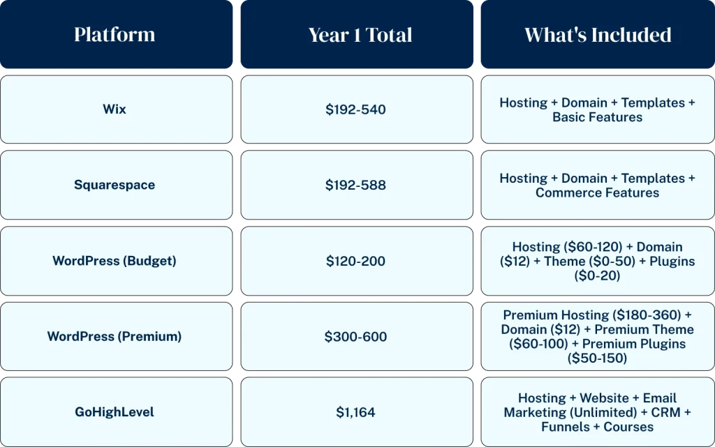

WordPress.org (Self-Hosted)
The Industry Standard
WordPress.org is the open-source software that powers over 43% of all websites on the internet. This is not to be confused with WordPress.com, which is a more limited, hosted version. When people talk about the power of WordPress, they mean the self-hosted version.
- How it Works: You choose a hosting company (like Bluehost or SiteGround) and install the free WordPress software. You then have complete control to customize your site with thousands of free and premium themes (design templates) and plugins (feature add-ons).
- Pros:
- Unlimited Flexibility: You can build literally anything with WordPress, from a simple blog to a complex membership site or online store.
- You Own Everything: You have full control over your files and data. You can move your site to a new host at any time.
- Massive Community: There is a huge ecosystem of themes, plugins, and developers. If you have a problem, someone has already solved it.
- Cons:
- Steeper Learning Curve: You are responsible for everything, including installation, security, backups, and updates. It can be intimidating for absolute beginners.
- Can Be More Expensive: While the software is free, costs for hosting, premium themes, and premium plugins can add up.
Who It’s For: Authors who want maximum control, flexibility, and the ability to grow their site into a powerful business asset. If you are even slightly tech-savvy and have long-term ambitions, WordPress is almost always the right answer. Our “Complete WordPress Setup Guide for Authors” walks you through the process.
Pro tip:
If you choose WordPress, invest in quality hosting from day one. Cheap hosting ($3/month) will make your site slow, frustrating, and vulnerable to hackers. Spend $10-15/month on SiteGround or Bluehost instead. Quality hosting is the difference between a site that loads in 1 second and one that takes 5+ seconds (and loses 50% of your visitors). This is the one place where saving $10/month will cost you hundreds in lost readers and sales.

Squarespace
The Design King
Squarespace is an all-in-one website builder known for its stunning, professionally designed templates and its ease of use. It’s a closed system, meaning you can’t use outside themes or plugins, but what it does, it does beautifully.
- How it Works: You sign up for a monthly or annual plan, choose a template, and use their drag-and-drop editor to customize it. Hosting is included.
- Pros:
- Beautiful Templates: Squarespace’s templates are modern, minimalist, and mobile-responsive out of the box. It’s very hard to make a bad-looking Squarespace site.
- Extremely Easy to Use: The interface is intuitive, and you don’t have to worry about security, updates, or hosting.
- All-in-One Simplicity: Everything you need is included in one package.
- Cons:
- Limited Customization: You are limited to the features and design options that Squarespace provides. There is no plugin ecosystem.
- Can Be More Expensive Long-Term: The monthly fees can be higher than basic WordPress hosting, especially if you need e-commerce features.
- You Don’t Own It: You are essentially “renting” your website. You can’t move your site to another platform easily.
Who It’s For: Authors who prioritize beautiful design and ease of use above all else. If you are a technophobe and just want a simple, elegant “brochure” website that looks great, Squarespace is an excellent choice. Check out our gallery of “Beautiful Squarespace Templates for Author Sites.”

Wix
The User-Friendly Contender
Wix is another popular all-in-one website builder that competes directly with Squarespace. It offers more templates and a more flexible drag-and-drop editor, but this flexibility can sometimes be a double-edged sword.
- How it Works: Similar to Squarespace, you sign up for a plan and use their editor to build your site. Hosting is included.
- Pros:
- True Drag-and-Drop: You can drag any element anywhere on the page, giving you more design freedom than Squarespace.
- Huge Template Library: Wix offers hundreds of templates for almost any industry.
- App Market: Wix has an “App Market” that offers more add-on functionality than Squarespace, though it’s still much smaller than the WordPress plugin library.
- Cons:
- Can Look Messy: The unstructured editor makes it easy to create a cluttered, unprofessional-looking site.
- Templates Aren’t Interchangeable: Once you choose a template, you can’t switch to a new one without rebuilding your site from scratch.
- SEO Concerns: Historically, Wix has had a reputation for poor SEO, though they have made significant improvements in recent years.
Who It’s For: Authors who want the simplicity of an all-in-one builder but desire more design flexibility than Squarespace offers. Our guide “When Wix Makes Sense for Authors” explores the specific use cases.

GoHighLevel
The Power Alternative
For the author who is also an entrepreneur, GoHighLevel presents a compelling alternative. It’s not just a website builder; it’s an all-in-one sales and marketing platform that includes a website and funnel builder, email marketing, a CRM, course hosting, and more.
- How it Works: GoHighLevel is a subscription service that replaces multiple other tools. You can build your entire author website and landing pages on their platform, and it integrates seamlessly with their powerful marketing automation tools.
- Pros:
- True All-in-One: Replaces your website host, email provider, landing page software, and more. This simplifies your tech stack and can save you money.
- Built for Conversions: The platform is designed from the ground up to build marketing funnels that convert visitors into buyers.
- Seamless Integration: Your website, email list, and sales funnels all talk to each other perfectly.
- Cons:
- Overkill for a Simple Website: If you just need a basic blog or brochure site, the power of GoHighLevel is more than you need.
- It’s a Business System: It requires a mindset shift from “building a website” to “building a marketing system.”
Who It’s For: The author-entrepreneur who wants to build a powerful, automated business. If you plan to sell courses, run complex marketing funnels, or manage a large author business, GoHighLevel is an investment that can provide a massive ROI. All of our advanced Author Funnel guides are built using this platform.
How easy it is to switch platforms later
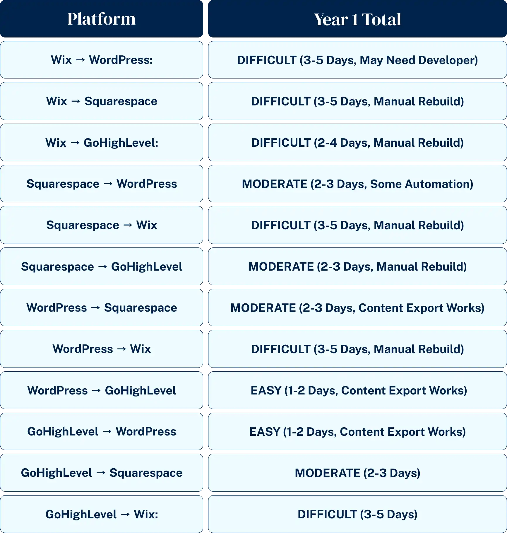
Pro tip:
Don't choose a platform based on what your favorite author uses. Their needs are different from yours. A six-figure author with 10 books might need WordPress's power, but you might be happier with Squarespace's simplicity. Choose based on YOUR technical comfort and YOUR goals, not someone else's setup. The best platform is the one you'll actually use and maintain, not the one with the most features you'll never touch.

Compare Website Builders Side-by-Side: A Head-to-Head Analysis

Marketing copy and feature lists don’t tell you the whole story. When you’re comparing website builders, the real questions are: What’s the true cost, including all the hidden fees? How hard is it really to use for a non-technical person?
And does it have the specific features an author actually needs, like e-commerce for selling books directly and built-in marketing tools? A platform can look great on the surface, but the wrong choice can lead to frustration, unexpected costs, and a website that doesn’t actually help you sell more books. This section provides a detailed, side-by-side comparison of the top website builders. We’re moving beyond the hype and into an honest breakdown of what you actually get.
We’ll compare WordPress, Squarespace, and Wix across five critical categories: Features, Pricing, Ease of Use, Customization, and SEO & Marketing. We’ll use clear comparison charts to help you make an informed decision based on real-world author needs, not just marketing promises.
Features Comparison Matrix
This table gives you a quick overview of the core features authors need and how each platform stacks up.
| Feature | WordPress.org | Squarespace | Wix |
|---|---|---|---|
| Blogging | Excellent (The best) | Very Good | Good |
| E-commerce (Direct Sales) | Excellent (via WooCommerce) | Very Good (Higher plan needed) | Good (Higher plan needed) |
| Email Marketing Integration | Excellent (Any provider) | Very Good (Major providers) | Good (Major providers) |
| SEO Tools | Excellent (via plugins like Yoast) | Very Good (Built-in) | Good (Built-in) |
| Templates/Themes | Unlimited (Thousands) | Excellent (Curated selection) | Good (Hundreds) |
| Plugin/App Ecosystem | Massive (50,000+ plugins) | None | Limited (App Market) |
| Ownership & Portability | Full Ownership | Rented | Rented |
Pricing Breakdown: What’s the True Cost?
Pricing can be deceptive. A low monthly fee might not include essential features like e-commerce or a professional email address. Here’s a realistic look at what you can expect to pay per year for a professional author website.
| Platform | Estimated Annual Cost (Basic) | Estimated Annual Cost (With E-commerce) | What’s Included |
|---|---|---|---|
| WordPress.org | $70 – $150 | $150 – $300+ | Hosting (Bluehost), Domain, Free Theme/Plugins. E-commerce cost is for premium plugins. |
| Squarespace | $192 – $276 | $312 – $588 | Hosting, Domain, Templates, Support. E-commerce requires higher-tier plans. |
| Wix | $204 – $348 | $324 – $600+ | Hosting, Domain, Templates, Support. E-commerce requires higher-tier plans. |
The Verdict: WordPress is almost always the cheapest option, especially when you factor in the power and flexibility you get. All-in-one builders like Squarespace and Wix have a higher, recurring cost that can increase significantly as you need more features. Our guide “Budget-Friendly Website Options That Don’t Look Cheap” explores this in more detail.
Ease of Use Ranking
This is subjective, but for a complete beginner, there’s a clear hierarchy.
- Squarespace: The easiest to use. The structured editor and beautiful templates make it hard to mess up.
- Wix: Very easy to use, but the unstructured editor can be overwhelming for some.
- WordPress: The most difficult for beginners. The initial setup and dashboard can be intimidating, but it becomes much easier with a good page builder like Elementor or Divi.
The Learning Curve: While WordPress has the steepest initial learning curve, its long-term potential is far greater. Investing a few weekends in learning the basics of WordPress can pay dividends for years. Our “Is WordPress Too Complicated for Beginners?” guide addresses this common fear.
Customization & Design Flexibility
How much control do you want over the look and feel of your site?
- WordPress: Unlimited customization. With thousands of themes and page builders like Elementor, you can create any design you can imagine. You have full access to the underlying code.
- Wix: High customization. The unstructured drag-and-drop editor gives you a lot of freedom to place elements anywhere.
- Squarespace: Medium customization. You are limited to the design options available within your chosen template. This is a feature, not a bug, as it helps maintain a clean, professional look.
SEO & Marketing Tools
Your website needs to be discoverable. How well does each platform help you with Search Engine Optimization (SEO) and marketing?
- WordPress: The best for SEO, hands down. With a free plugin like Yoast SEO or Rank Math, you have granular control over every aspect of your on-page SEO. The ability to add any marketing tool or script gives you unlimited marketing potential.
- Squarespace: Very good built-in SEO tools. It handles all the technical SEO for you and gives you the essential controls you need.
- Wix: Good built-in SEO tools. Wix has made huge strides in this area and now provides a solid set of tools for most users.
For authors who are serious about marketing, the ability to integrate with any tool is critical. This is where WordPress shines. For authors who want an all-in-one system where the marketing tools are already built-in and seamlessly integrated, a platform like GoHighLevel is the superior choice, combining a website builder with a full suite of professional marketing tools that standalone builders can’t match. Our “Built-in Marketing Features Compared” guide offers a deeper analysis.
Essential Pages Every Author Needs (And How to Make Them Great)

Most author websites fail not because of their design, but because of their content. They have confusing navigation, missing pages, or pages that don’t serve a clear purpose. A successful author website isn’t a digital resume that lists your accomplishments; it’s a strategic tool designed to guide visitors on a journey.
That journey should lead them from casual browser to engaged fan to loyal reader. This is accomplished through a small set of essential pages, each with a specific job to do. This section covers the four must-have pages every author website needs: a Home Page that converts, an About Page that connects, a Books Page that sells, and a Contact Page that’s easy to use. We’ll also cover the most important page of all—your Newsletter Signup Integration.
We’ll break down the strategic purpose of each page and provide simple formulas for creating content that works. Build these pages correctly, and you’ll have a website that serves both your readers and your author business.
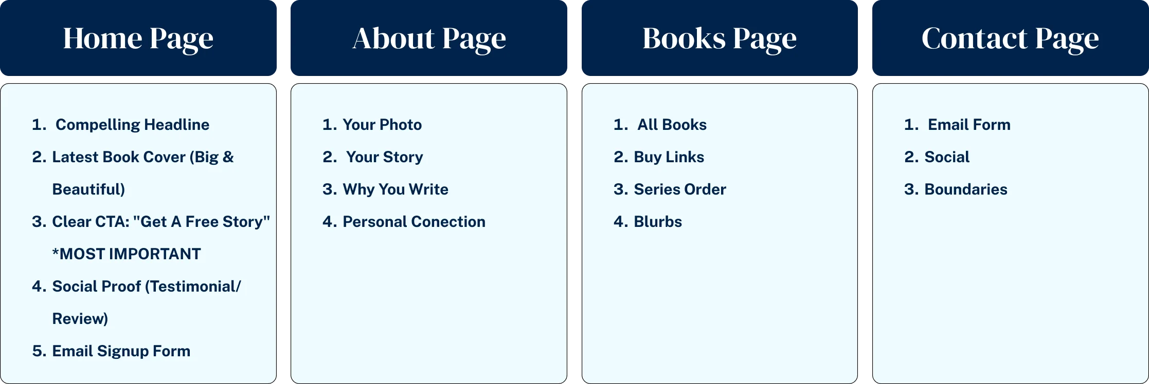
Your Essential Author Website Structure
Your Digital Handshake
The Home Page
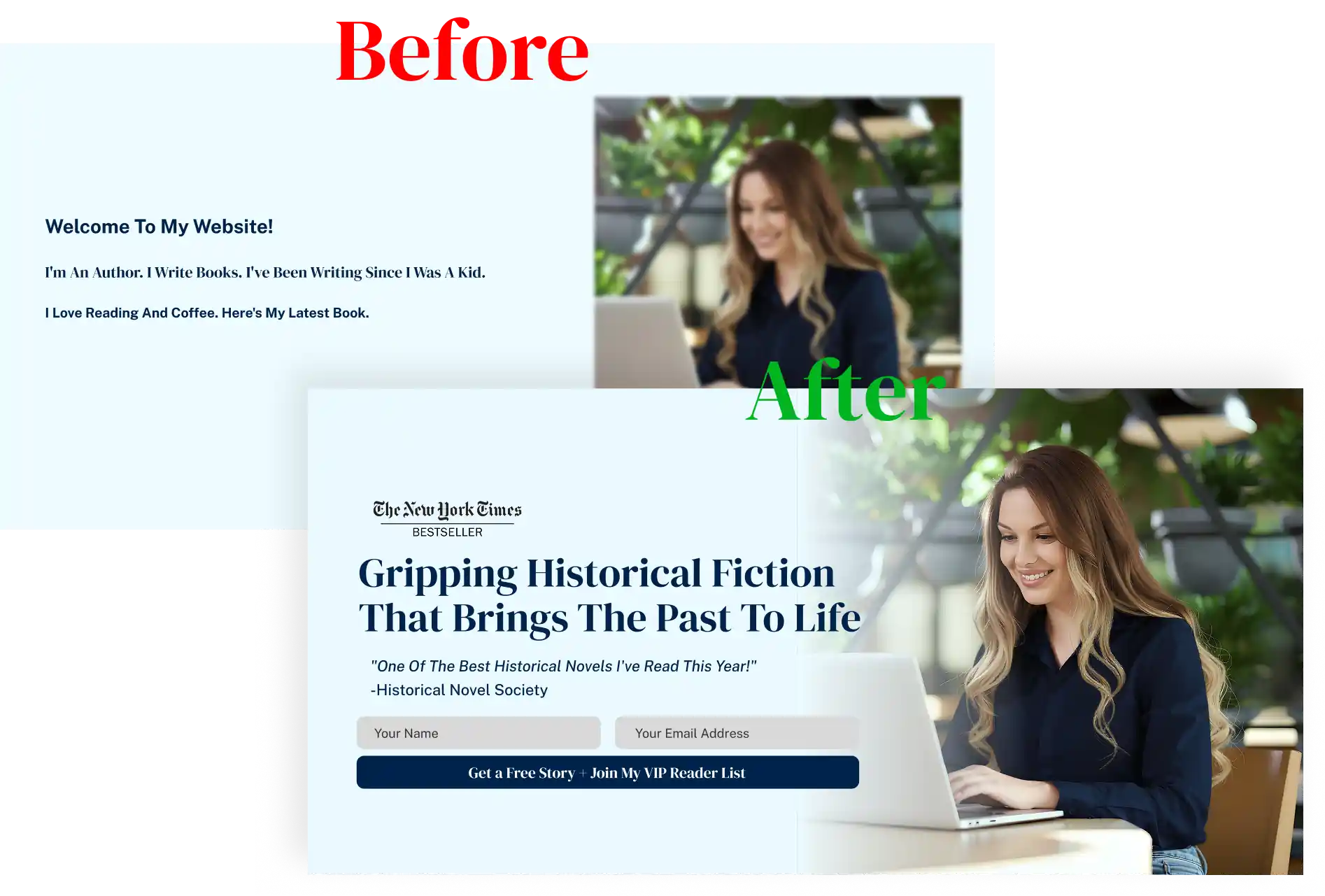
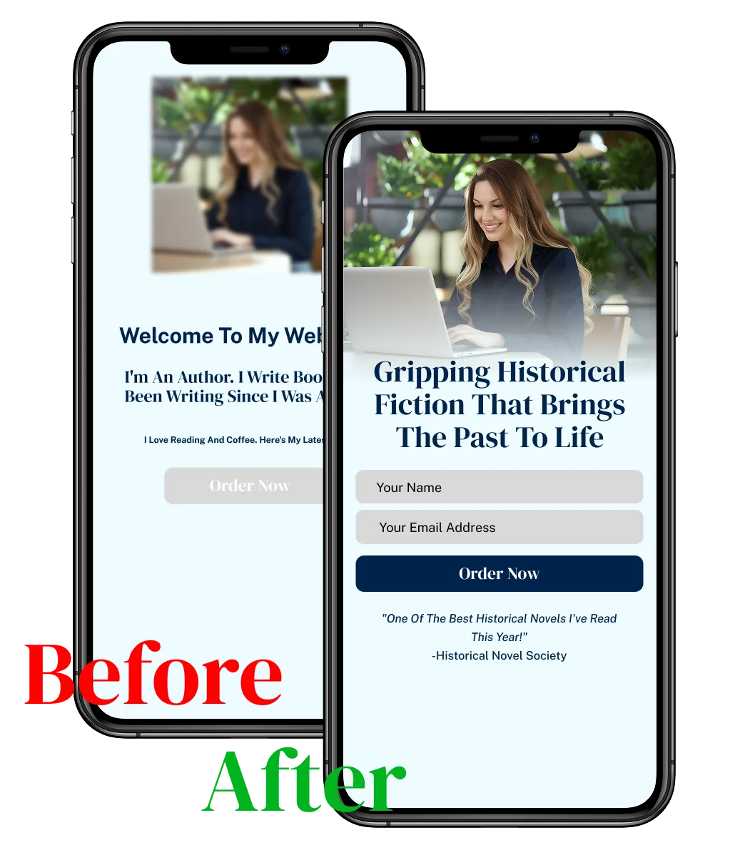
Your home page is the most valuable real estate on your site. It’s the first impression you make on a new visitor, and you have about three seconds to convince them to stay. Its job is not to tell them everything about you, but to quickly answer three questions: Who are you? What do you write? And what should I do next?
- The Formula for a Home Page That Converts:
- A Compelling Headline: A single sentence that captures the essence of your books (e.g., “Thrilling historical fiction that brings the past to life.”).
- Your Latest Book Cover: The most important visual on the page. Make it big and beautiful.
- A Clear Call-to-Action (CTA): The single most important thing you want visitors to do. For most authors, this should be signing up for your email list. (e.g., “Get a Free Story” or “Join My VIP Reader List”).
- Social Proof: A short testimonial from a well-known author or a snippet from a great review.
Our guide “Homepage Formulas That Work” provides several templates you can adapt.
Home Page Before and After
Pro tip:
Your home page headline should pass the "3-second test." A visitor should be able to land on your site and understand what you write within 3 seconds. "Welcome to my website!" fails this test. "Cozy Mysteries with a Touch of Magic" passes. Use your genre + your unique angle. Test your headline by showing your website to a friend for 3 seconds, then asking them what you write. If they can't answer, rewrite your headline.
Building a Connection
The About Page
After your home page, your About Page will be the most visited page on your site. Readers are curious people; they want to know the person behind the books. This is your opportunity to build a personal connection. This is not the place for a dry, third-person bio.
- How to Write an About Page Readers Care About:
- Write in the First Person: Use “I,” not “[Your Name].” Make it a conversation.
- Tell a Story: Why do you write what you write? What’s your passion? What’s your journey?
- Include a Professional Photo: Readers want to see your face. Invest in a good headshot.
Keep it Concise: A few well-written paragraphs are more effective than a wall of text. Our guide “Author Bio vs. About Page: The Difference” explains how to craft both
Your Digital Bookshelf
The Books Page
This is where you showcase your work. The goal is to make it as easy as possible for a reader to learn about your books and, most importantly, to buy them. Don’t just list your books; sell them.
- Best Practices for a Books Page That Sells:
- Large, High-Resolution Covers: Your book cover is your most important sales tool. Make it shine.
- Engaging Blurbs: Your book description should be compelling and hook the reader.
- Clear Buy Links: Use prominent buttons for all major retailers (Amazon, Apple Books, Barnes & Noble, etc.). A universal book link service like Books2Read is a great tool to create a single link that goes to all stores.
- Organize by Series: If you write in series, group your books together in the correct reading order. This is crucial for reader experience.
Making it Easy to Reach You
The Contact Page
This is where you showcase your work. The goal is to make it as easy as possible for a reader to learn about your books and, most importantly, to buy them. Don’t just list your books; sell them.
- Best Practices for a Books Page That Sells:
- Large, High-Resolution Covers: Your book cover is your most important sales tool. Make it shine.
- Engaging Blurbs: Your book description should be compelling and hook the reader.
- Clear Buy Links: Use prominent buttons for all major retailers (Amazon, Apple Books, Barnes & Noble, etc.). A universal book link service like Books2Read is a great tool to create a single link that goes to all stores.
- Organize by Series: If you write in series, group your books together in the correct reading order. This is crucial for reader experience.
The Most Important Page
Your Newsletter Signup
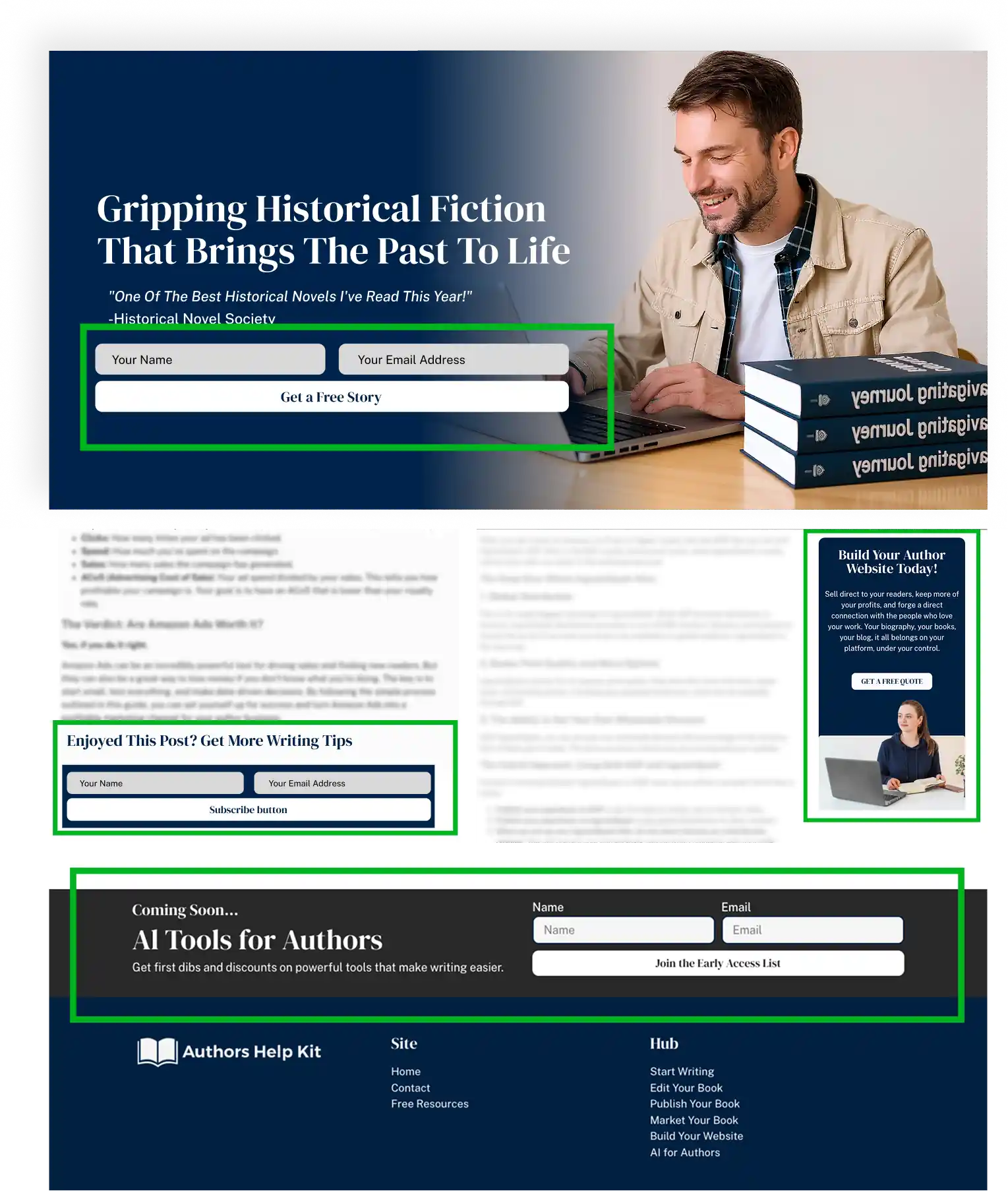
Your newsletter signup isn’t a single page, but it’s the most important conversion goal of your entire website. Your email list is your direct line to your readers, and your website is your #1 tool for building that list. Your signup form should be everywhere.
- Where to Place Email Opt-ins for Maximum Conversions:
- In the Header/Navigation: A prominent “Get a Free Book” link in your main menu.
- On Your Home Page: A clear call-to-action above the fold.
- At the End of Every Blog Post: If you have a blog, every post should end with a relevant signup form.
- In Your Website Footer: A simple form at the bottom of every page.
- A Dedicated Landing Page: A full page dedicated to your reader magnet, which you can build with MailerLite or GoHighLevel. Our guide “Creating Irresistible Newsletter Offers” has more ideas.
Where to place email optins for maximum conversions
Pro tip:
Don't just say "Subscribe to my newsletter." That's boring and low-value. Instead, offer a specific, compelling reader magnet: "Get a free prequel novella," "Download the character guide," or "Access exclusive deleted scenes." Use MailerLite (free up to 1,000 subscribers) or GoHighLevel (if you want advanced automation) to deliver your freebie automatically. A good reader magnet can increase your signup rate by 300-500% compared to a generic newsletter offer.
Design Tips From Successful Authors: Look Like a Pro (Even if You’re Not)

A professional-looking website builds instant trust and credibility. A site that looks amateurish, cluttered, or dated does the opposite—it signals to visitors that you might not be a professional author. The good news is that you don’t need to be a graphic designer or have a huge budget to create a beautiful website.
By following a few simple design principles, you can create a site that looks polished, cohesive, and on-brand. It’s not about fancy animations or complex layouts; it’s about making smart, simple choices. This section shares the key design tips that successful authors use to make their websites shine.
We’ll show you how to choose Colors and Fonts that reflect your genre and brand, how to use Photography and Graphics effectively (without breaking the bank), and the importance of creating a Cohesive Brand Look across your website and social media.
We’ll also cover two critical technical aspects of design that are often overlooked: Website Speed and Performance and Accessibility. These are the small changes that make a big impact, transforming your website from a DIY project into a professional author platform.
Choosing Your Colors and Fonts
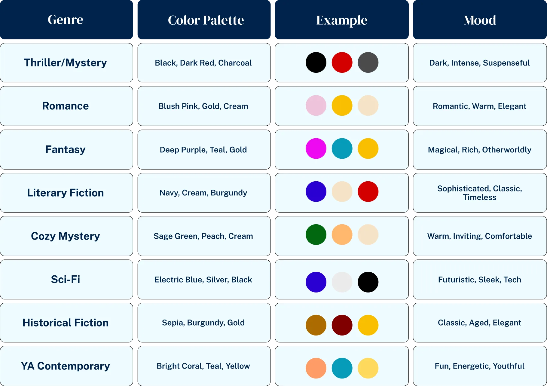
Your color palette and font choices are the foundation of your visual brand. They should be consistent with the genre you write in.
- Color Palette: Choose a simple palette of 2-3 colors. A good formula is a dominant color, a secondary color, and an accent color for buttons and links. Look at the covers of bestselling books in your genre. What colors do you see? Thriller authors often use dark, moody colors like black and red. Romance authors might use soft pastels or rich, passionate colors. Use a tool like Coolors.co to generate a professional color palette.
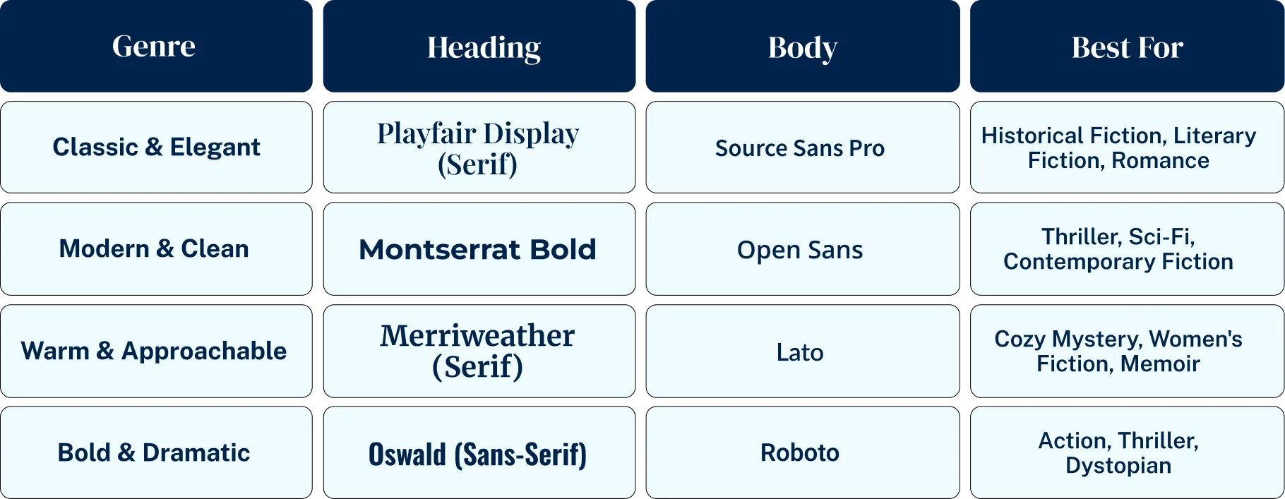
- Font Pairings: Just like with colors, keep your fonts simple. Choose two fonts: one for your headings and one for your body text. Your body font should be clean and easy to read (a serif font like Georgia or a sans-serif font like Open Sans). Your heading font can have more personality. Google Fonts offers a huge library of free, high-quality fonts. Our guide “Font Pairings That Look Professional” provides several great combinations.
Using Photography and Graphics
Visuals make your site more engaging. The most important visual is your author headshot.
- Author Headshot: Invest in a professional headshot. It’s one of the best marketing investments you can make. Your photo should match your brand. A thriller author might have a more serious, moody photo, while a children’s author should have a warm, smiling photo.
- Stock Photography: For other images on your site, you can use high-quality stock photos. Avoid cheesy, generic stock photos. Use sites like Unsplash or Pexels for beautiful, free stock photography. For paid options, Depositphotos is a great, affordable choice.
- Graphics: Use a tool like Canva to create simple, professional graphics for your blog posts or social media links. Using consistent templates, fonts, and colors in Canva is an easy way to create a cohesive brand look. Our guide “Why My Graphics With Canva Look Pro” shows you how.
Pro tip:
Your author headshot is one of the best marketing investments you can make. Hire a professional photographer for 1-2 hours ($150-300) and get 10-20 high-quality photos you can use for years. A professional headshot builds instant credibility and trust. Readers buy from people they feel they know, and a great photo is the first step in building that connection. Don't use a cropped wedding photo or a selfie—invest in your brand.
Creating a Cohesive Brand Look
Your brand is more than just your website. It’s your book covers, your social media profiles, and your email newsletter. A consistent visual brand makes you instantly recognizable.
- Match Your Website to Your Book Covers: Your website’s color palette and font choices should be inspired by your book covers. This creates a seamless experience for the reader.
- Brand Consistency Across Platforms: Use the same profile picture, color scheme, and fonts on your website, your Facebook page, your Twitter profile, and your email newsletter template in MailerLite or GoHighLevel. This reinforces your brand and makes you look professional.
Website Speed and Performance
Design isn’t just about how your site looks; it’s also about how it performs. A slow-loading website is one of the top reasons visitors leave. Every second counts.
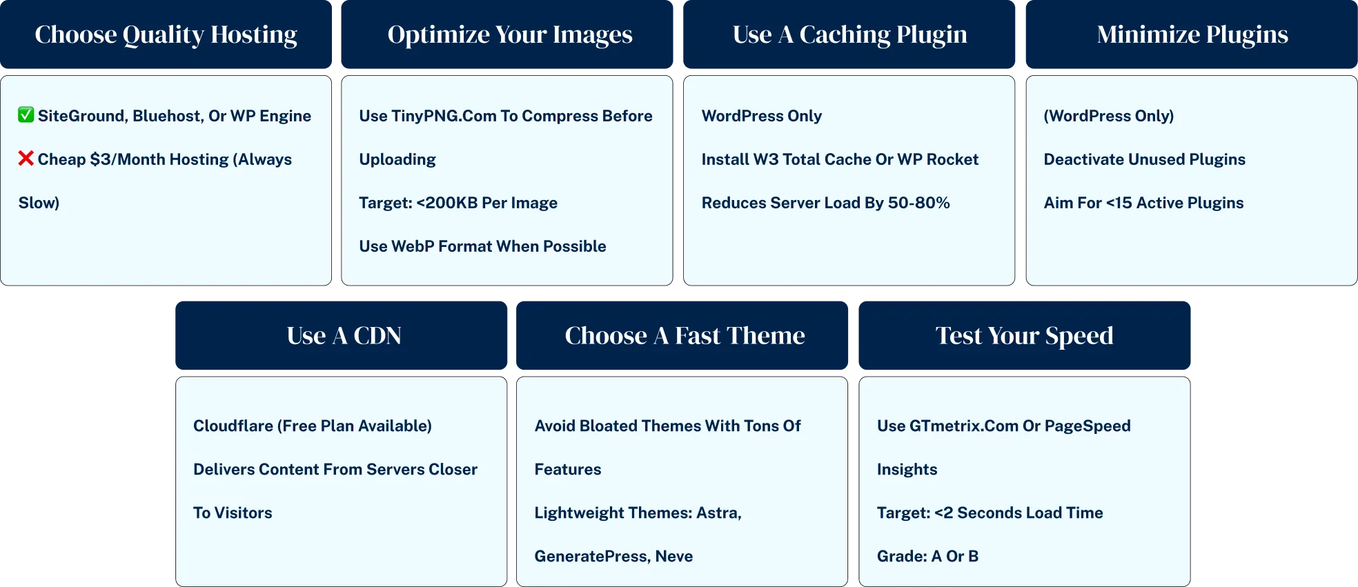
- Why Site Speed Matters: Studies show that if a page takes longer than 3 seconds to load, over 50% of visitors will abandon it. A slow site will kill your conversions and hurt your search engine rankings.
- How to Make Your Website Load Faster:
- Choose Good Hosting: Your hosting provider has the biggest impact on your site speed. Cheap hosting is almost always slow hosting. Invest in a quality host like SiteGround.
- Optimize Your Images: Large image files are the #1 cause of slow websites. Before you upload an image, use a tool like TinyPNG to compress it without losing quality.
- Use a Caching Plugin: For WordPress users, a caching plugin like W3 Total Cache or WP Rocket can dramatically improve your site speed.
Pro tip:
Before you upload any image to your website, run it through TinyPNG.com (free). This one simple step can reduce your image file size by 70% without any visible quality loss. Large images are the #1 cause of slow websites. A single uncompressed book cover can be 2-5MB—that's enough to make your entire page load slowly. Compress it to 200-300KB and your site will load 5-10x faster. This takes 30 seconds per image and can double your conversion rate.
Accessibility Considerations
Good design is accessible design. Your website should be usable by everyone, including people with disabilities.
- Basic Accessibility Checklist:
- High-Contrast Colors: Ensure your text color has enough contrast with your background color to be easily readable.
- Alt Text for Images: Add descriptive “alt text” to all your images. This is what screen readers use to describe the image to visually impaired users, and it’s also good for SEO.
- Clear Link Text: Use descriptive link text. Instead of “click here,” use “read the first chapter.”

Website Mistakes (And How to Avoid Them): Is Your Website Killing Your Sales?

Most author websites fail not because of a lack of effort, but because of a series of preventable mistakes that undermine everything else. You can have a beautiful design and brilliant blog posts, but if your site has overcomplicated navigation, no clear call-to-action, or isn’t mobile-friendly, you are actively losing readers and sales.
These critical mistakes kill effectiveness, create a frustrating experience for visitors, and turn your website from a powerful marketing asset into a glorified business card that doesn’t actually do any business.
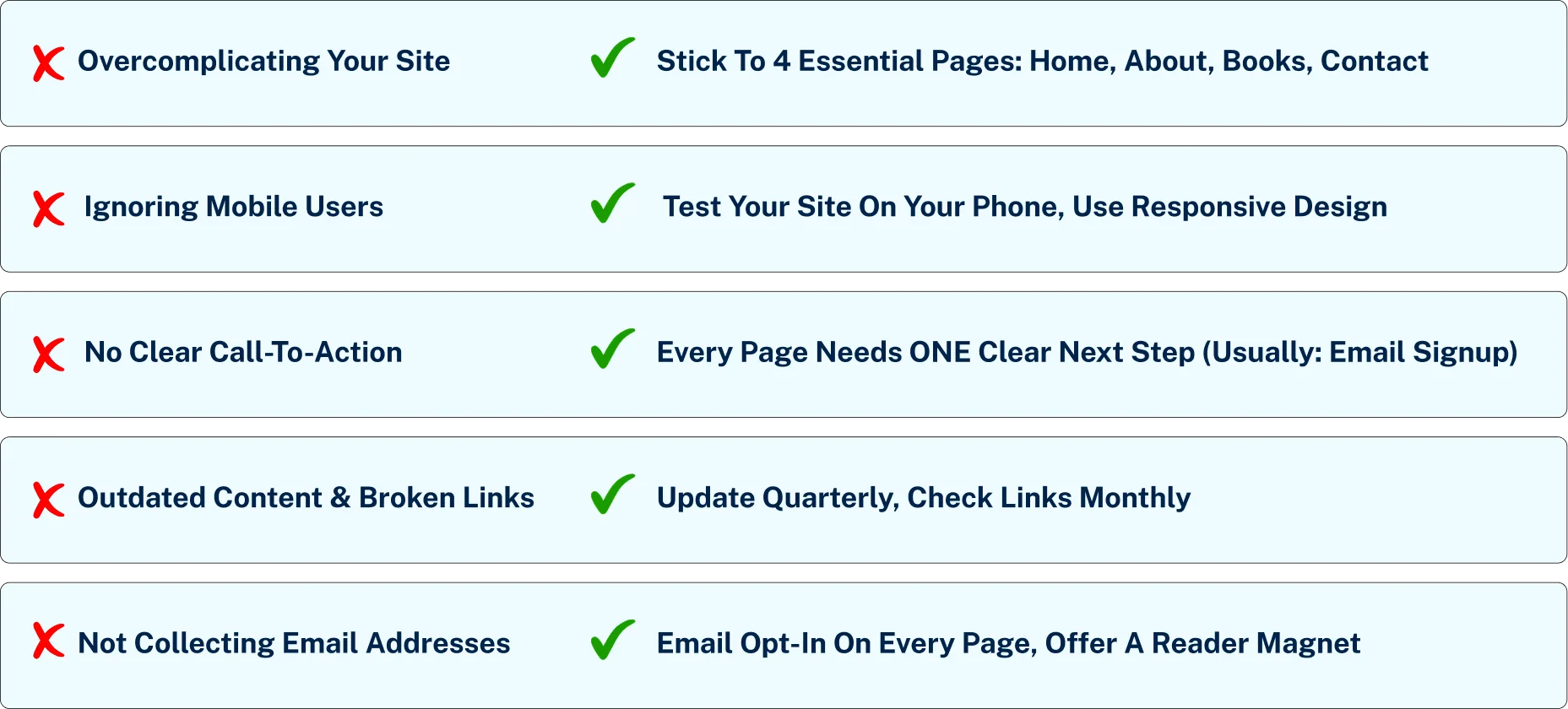
This section identifies the biggest website mistakes authors make and provides simple, specific strategies to correct them. We’ll cover the danger of Overcomplicating Your Site, the sin of Ignoring Mobile Users, the confusion of having No Clear Call-to-Action, the trust-killer of Outdated Content and Broken Links, and the cardinal sin of author websites: Not Collecting Email Addresses. Avoid these mistakes, and you’ll have a website that works for your author business, not against it.
The 5 website mistakes that kill sales
Mistake #1
Overcomplicating Your Site
More is not better. Authors often feel the need to cram every possible piece of information onto their site, resulting in a cluttered, confusing mess with dozens of menu items. When visitors are confused, they leave.
- How to Avoid It: Keep it simple. Your website only needs to do a few things well. Stick to the Essential Pages Every Author Needs: Home, About, Books, and Contact. Your navigation menu should be clean and simple. If a visitor can’t figure out where to go in a few seconds, you’ve already lost them. Our guide “Simplifying Your Menu” shows you how to create a navigation structure that makes sense.
Pro tip:
If your website navigation has more than 5-6 menu items, you're overwhelming your visitors. The paradox of choice is real—more options lead to fewer conversions. Audit your menu right now. Do you really need separate pages for "Press," "Events," "Awards," and "Media Kit"? Probably not. Combine them into a single "Media" page or remove them entirely. Your readers care about three things: your books, your story, and how to stay in touch. Everything else is noise.
Mistake #2
Ignoring Mobile Users
In 2025, over half of your website visitors will be on a mobile device. If your site is difficult to read or navigate on a phone, you are alienating the majority of your potential readers. This is no longer an optional consideration; it’s a requirement.
- How to Avoid It: Choose a modern, responsive website platform. Squarespace, Wix, and modern WordPress themes are all designed to be mobile-responsive out of the box. But don’t just trust the template. Test your site on your own phone. Can you easily read the text? Are the buttons easy to click? Does the menu work properly? Our guide “Why Mobile-Responsive Design Matters” provides a checklist for mobile testing.
Mobile responsive design, why it matters
Mistake #3
No Clear Call-to-Action (CTA)
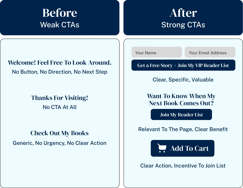
A visitor lands on your homepage. They read your headline. Now what? If you don’t tell your visitors what you want them to do next, they will do nothing. Every page on your site should have a clear, obvious next step.
- How to Avoid It: Decide on the #1 most important action you want a visitor to take. For 99% of authors, this is signing up for your email list. Make this the most prominent call-to-action on your site. Use clear, action-oriented language on your buttons (e.g., “Get My Free Story” instead of “Submit”). Our guide “Creating Obvious Next Steps” shows you how to guide your visitors on a journey.
Mistake #4
Outdated Content and Broken Links
A website with a blog that hasn’t been updated since 2018, an “Upcoming Events” page that lists events from last year, or links that lead to 404 error pages sends a clear message: this author is not active or professional. It instantly kills credibility.
- How to Avoid It: Schedule a Quick Maintenance Checklist once a quarter. Click through all your links to make sure they still work. Update your events page. If you have a blog you no longer update, either remove it or add a note to the top explaining that it’s an archive. It’s better to have no blog at all than a dead one. The cost of neglecting your website is a slow erosion of reader trust.
Mistake #5
Not Collecting Email Addresses
This is the single biggest and most costly mistake an author can make with their website. Your website’s #1 job is to turn anonymous visitors into known fans by getting them to sign up for your email list. If your website is not actively building your email list, it is failing as a marketing tool.
- How to Avoid It: Make email collection the central focus of your website. Offer a compelling Reader Magnet that your ideal reader can’t resist. Place your email sign-up forms in high-visibility locations: your homepage, your navigation menu, the end of every blog post, and your footer. Use a professional email service like MailerLite or GoHighLevel to manage your list and deliver your magnet. Your website is your best list-building tool. Don’t let it go to waste. Our guide on “Effective Lead Magnet Placement” is essential reading.
Pro tip:
Your email list is 10-20x more valuable than your social media following. If Instagram shut down tomorrow, you'd lose your entire audience. But if you have 1,000 email subscribers, you have a direct line to 1,000 people who will buy your next book. Treat email collection as the #1 goal of your website. Every page, every blog post, every interaction should gently guide visitors toward joining your list. Use MailerLite (free) or GoHighLevel (advanced) to manage your list professionally.
I launched my website within a week, started collecting email subscribers right away, and finally have a digital home I’m proud to share.
“I can’t overstate how valuable the Build Your Author Website hub was for me. Before finding Authors Help Kit, I had wasted weeks trying to decide between WordPress and Squarespace, and every tutorial I found either assumed I was a web developer or tried to sell me something.
This hub changed everything, it walked me through the entire process in plain language, from choosing my domain to designing pages that actually connect with readers. The comparison charts were a lifesaver; I finally understood what each platform offered and picked one that fit my goals perfectly.
The section on ‘Essential Pages Every Author Needs’ helped me craft an About page and Books page that genuinely reflect my author brand. What impressed me most was how professional my site now looks, and I built it myself, without paying for an expensive designer. I launched my website within a week, started collecting email subscribers right away, and finally have a digital home I’m proud to share. This hub made what once felt impossible, simple and achievable.”
Jenna L.,
Author